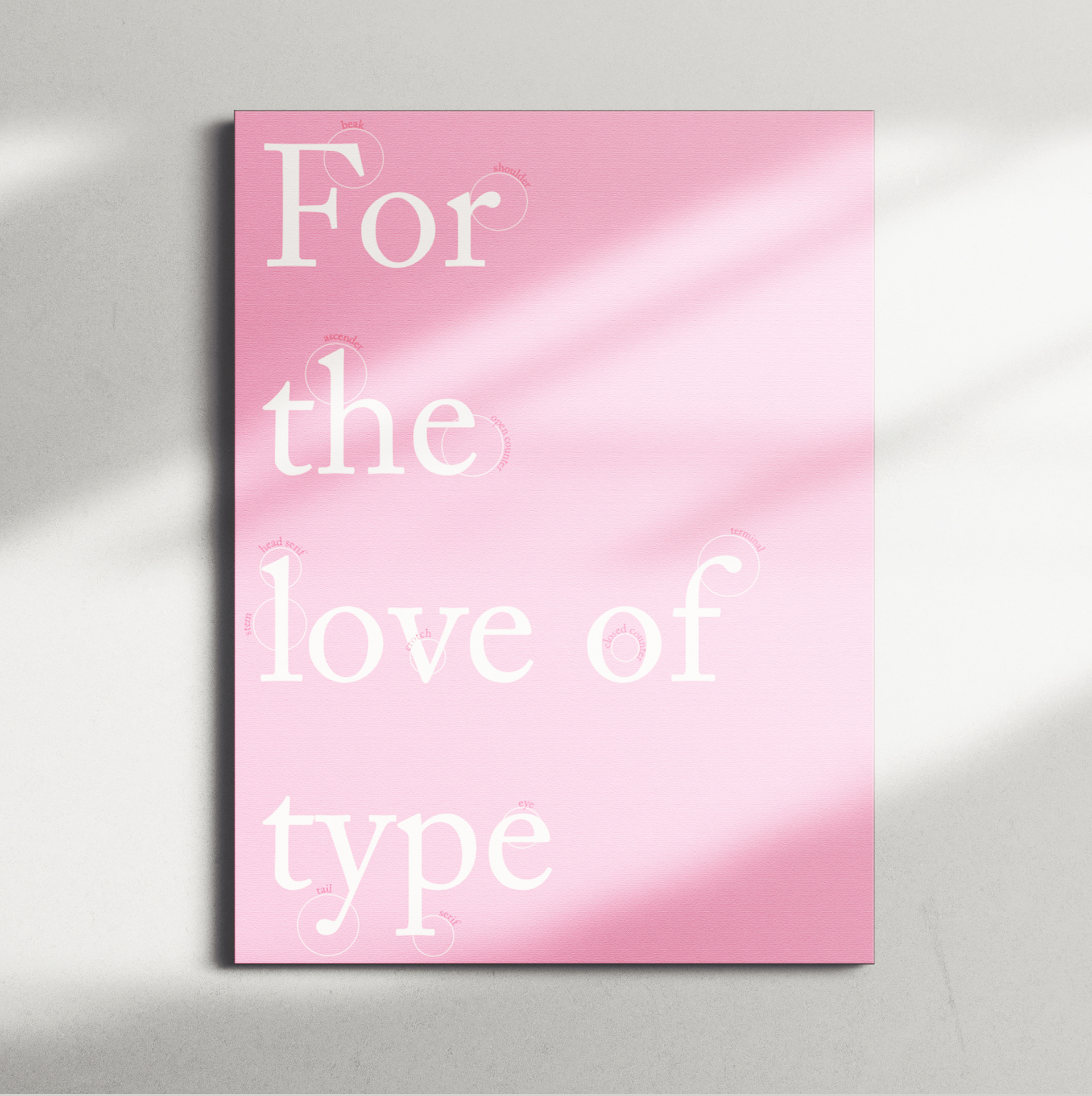
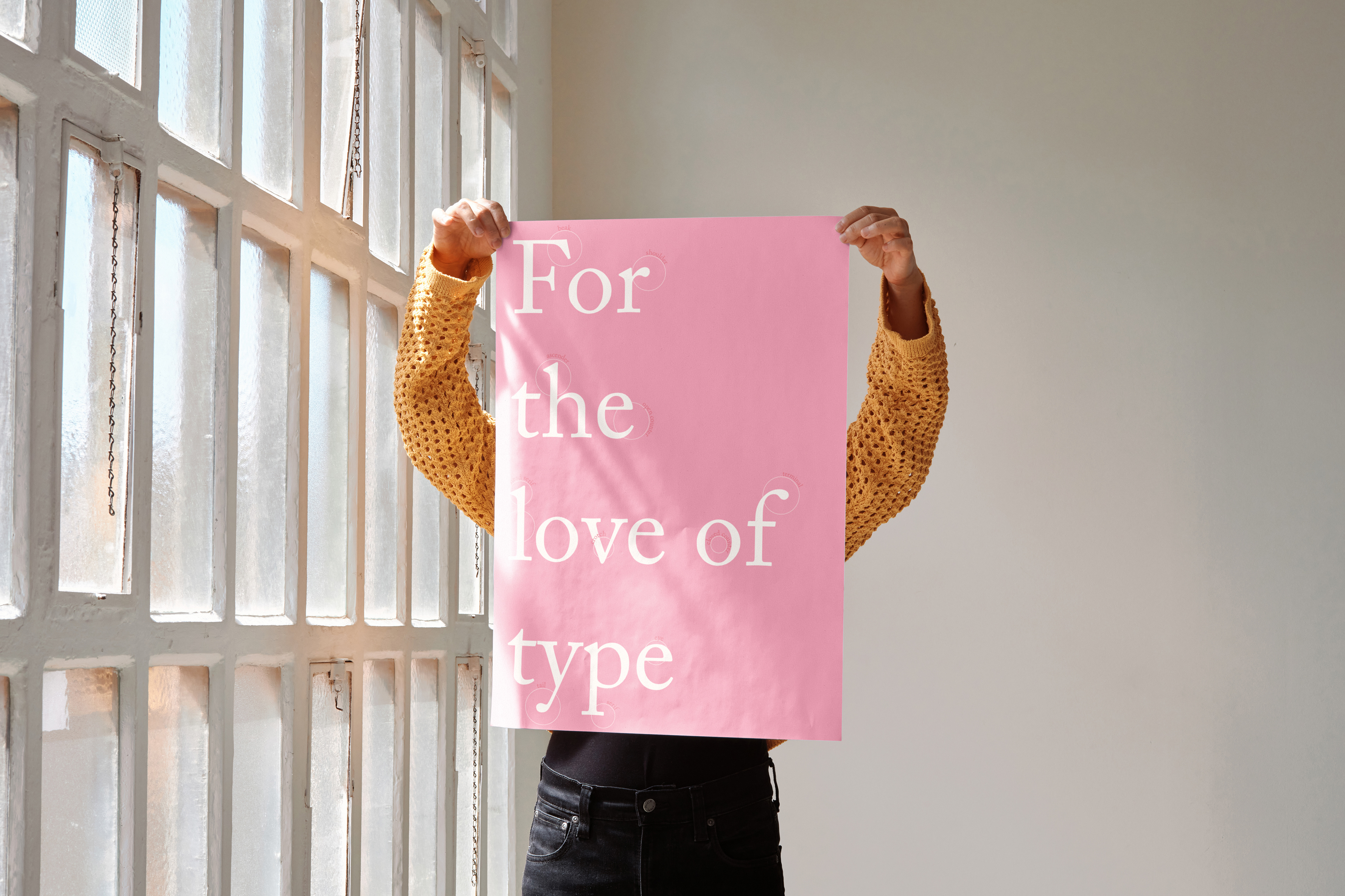
For the Love of Type is a typographic poster that leans into the fun side of lettering while breaking down type anatomy in a clear, visual way. The design highlights key parts of letterforms through bold hierarchy, thoughtful spacing, and intentional layout choices that keep the information easy to follow and visually engaging. By mixing educational content with expressive typography, this project celebrates the personality of type while reinforcing how structure, proportion, and detail play a major role in effective design.