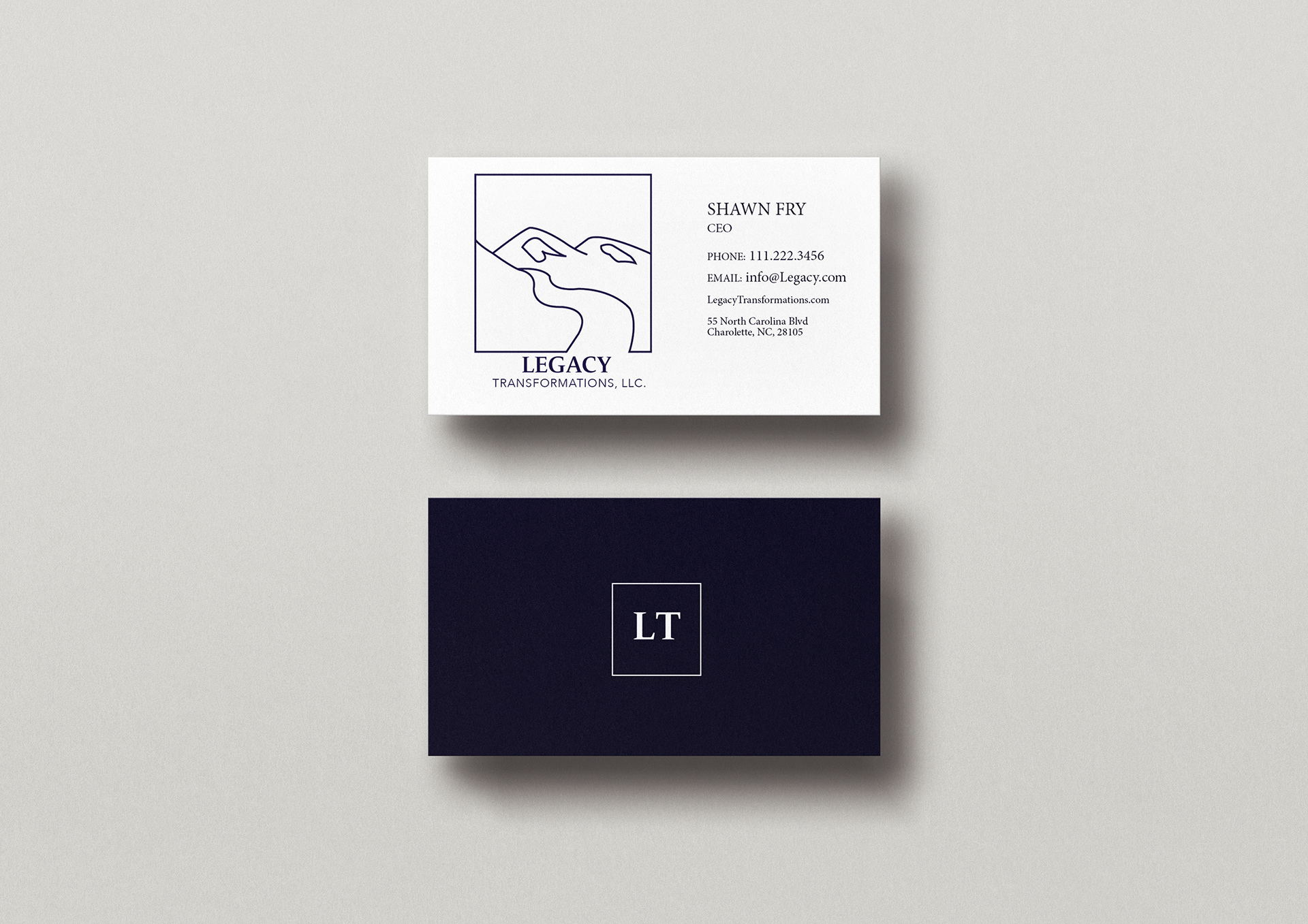
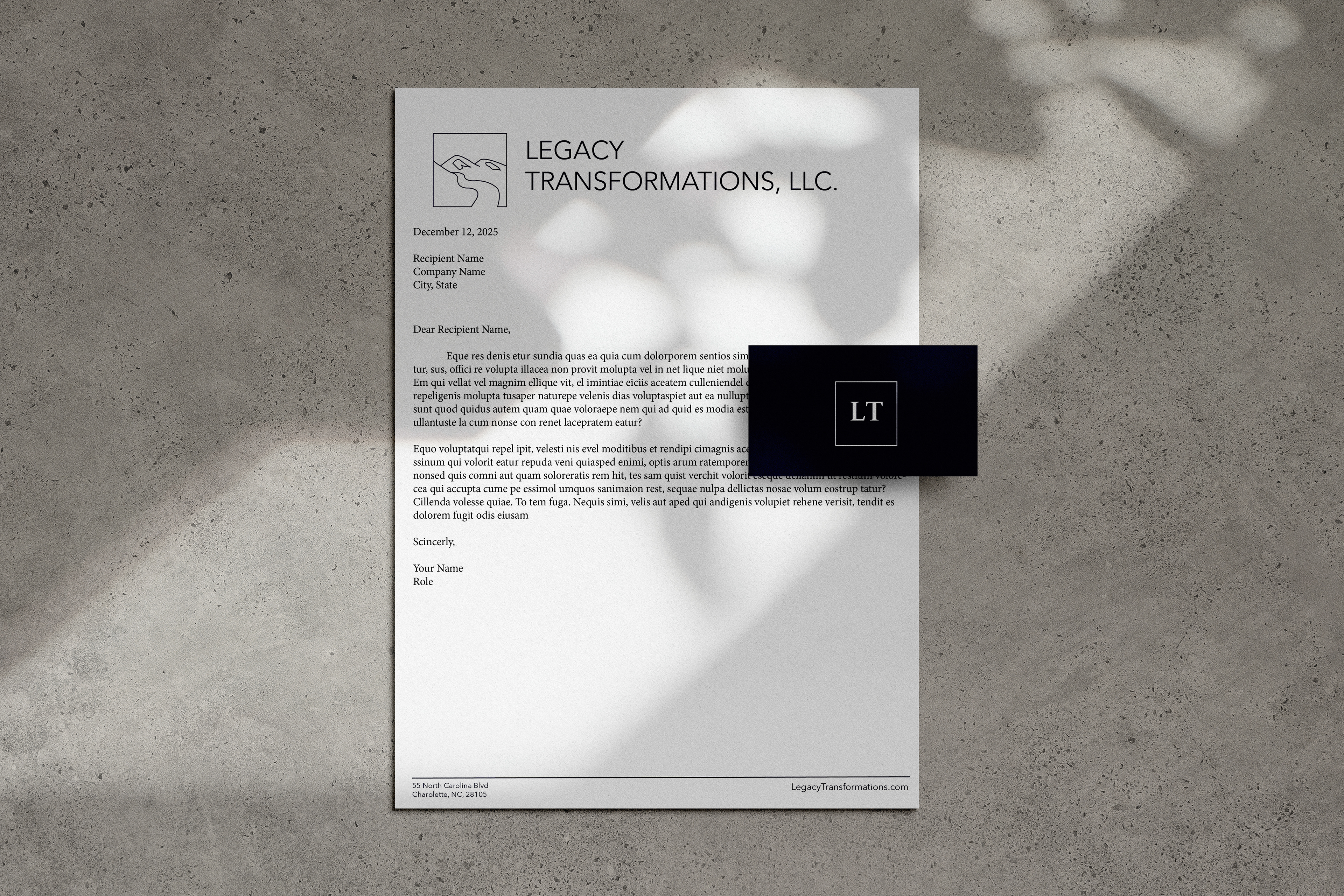
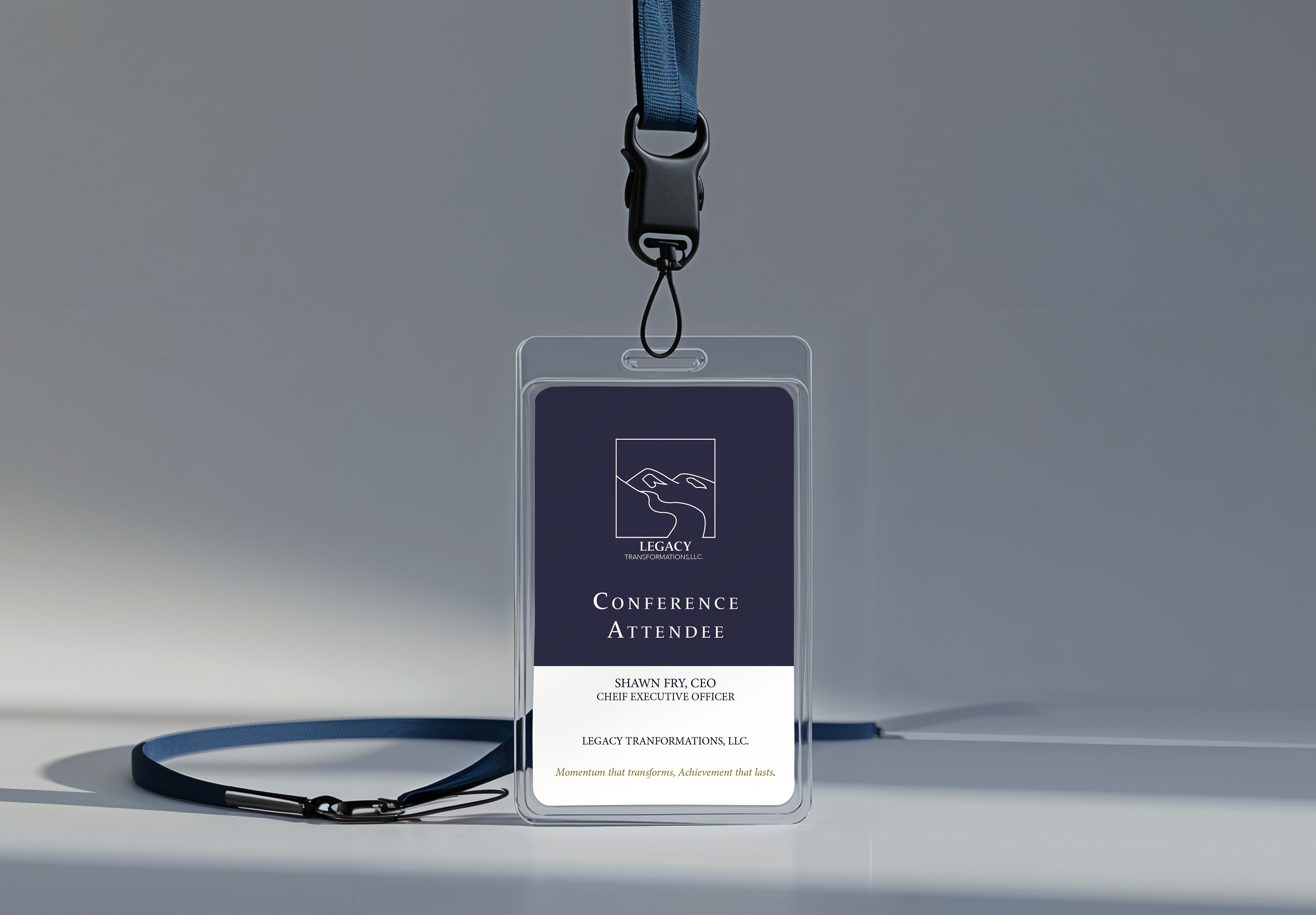
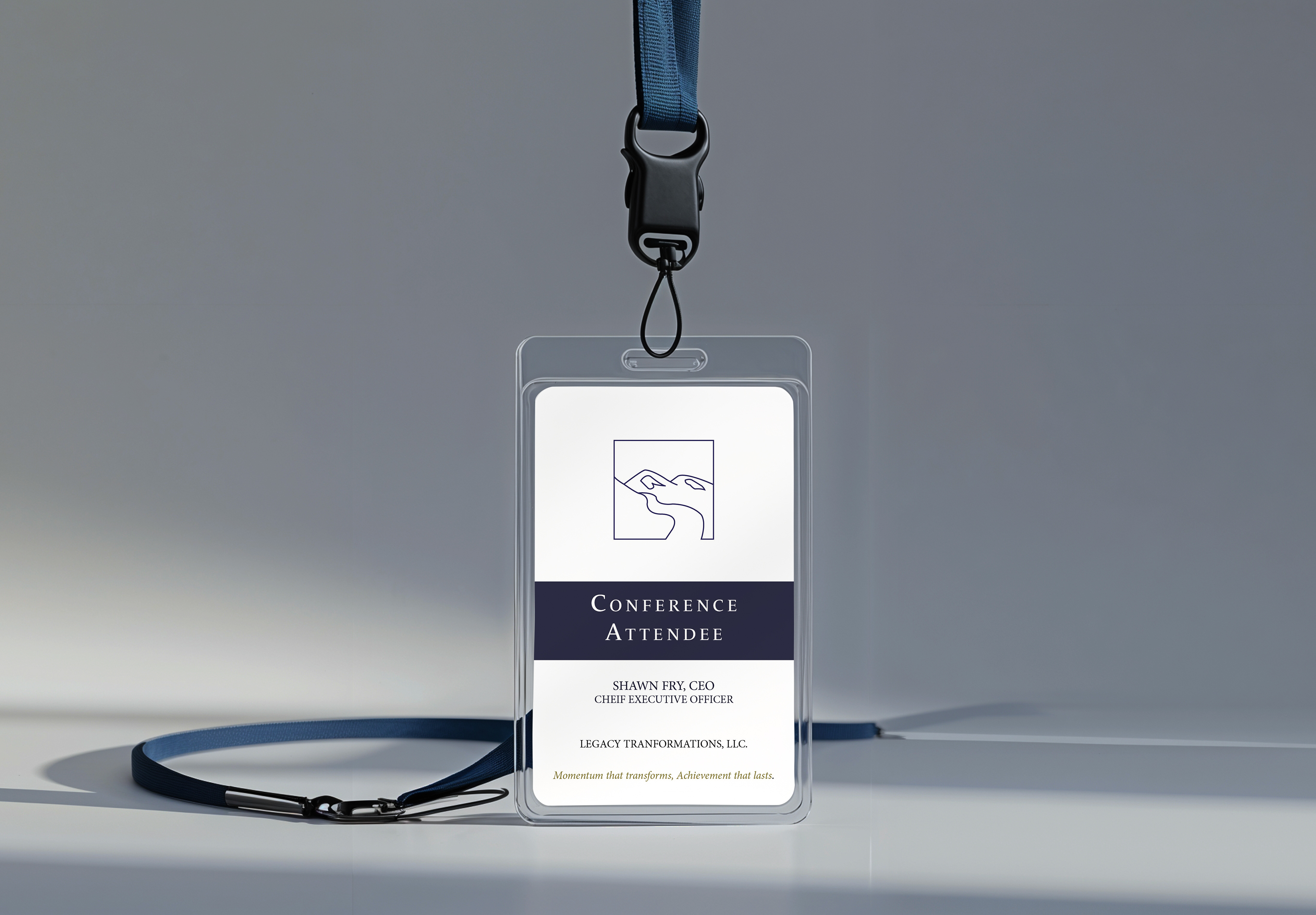
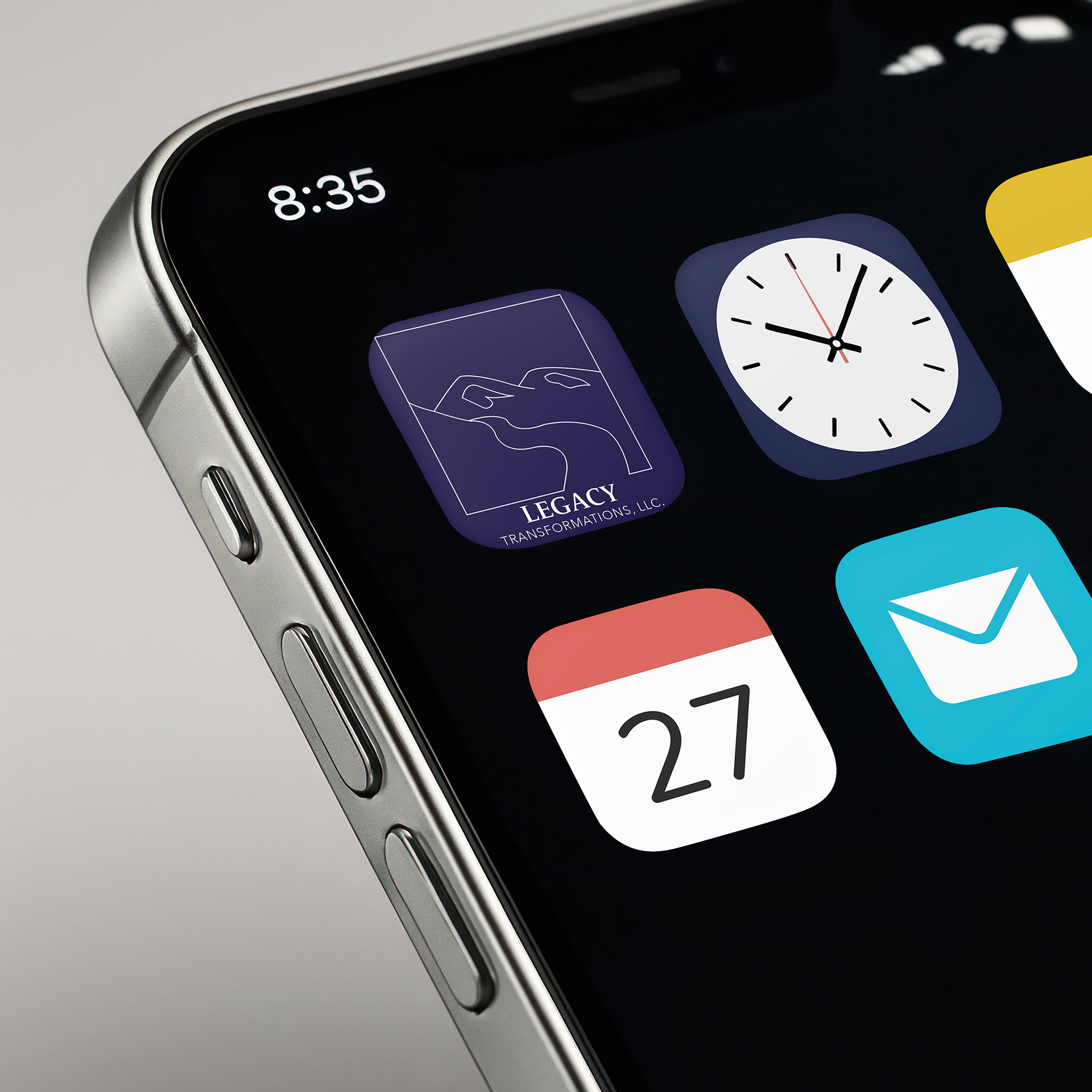
This rebrand was created for an advertising agency, with the goal of developing a clear, durable identity that reflects long-term impact rather than short-term trends. The logo uses mountain and river forms to emphasize steady progress over time. All elements are framed within a square to establish structure and balance, while the river intentionally breaks that boundary to suggest ongoing movement and adaptability. The mark was developed using a consistent single line weight for clarity and cohesion, then refined in Illustrator and applied across multiple touchpoints to ensure usability across the brand system.

FINAL OBSERVATIONS
As I began this project, my initial direction centered on the imagery
of rivers and mountains. I explored visual themes such as nature, flow,
stability, and elevation, using mind-mapping and word association to
connect these ideas to growth, guidance, and leadership. Early on, this
concept felt meaningful and aligned with the values I wanted the brand
to communicate.
As I continued developing the concept, I became more aware of how
frequently mountain imagery appears in branding, particularly for com-
panies that want to communicate strength or ambition. This led me to
briefly question whether the direction was distinctive enough. Through
additional brainstorming and thumbnail sketching, I explored alternative
ideas, including a bridge formed from the shape of an eagle’s wing, which
symbolized connection, confidence, and vision.
After experimenting with both directions, I ultimately returned to the river and
mountain concept. As the logo developed further in Illustrator, I realized this
idea remained the strongest and most authentic to the brand. The combination
of the mountain and river clearly communicates stability, growth, and forward
movement, while also feeling grounded and timeless rather than overly trendy.
It was also a concept I genuinely enjoyed working with, which allowed me to
refine it more thoughtfully.
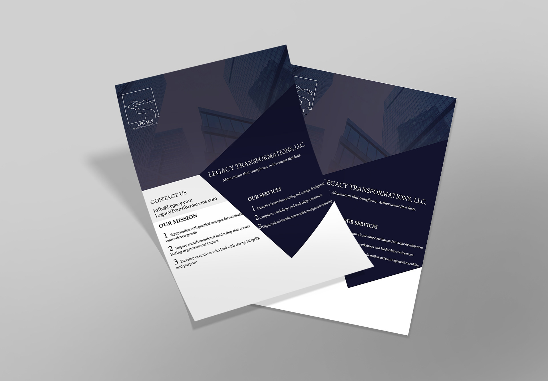
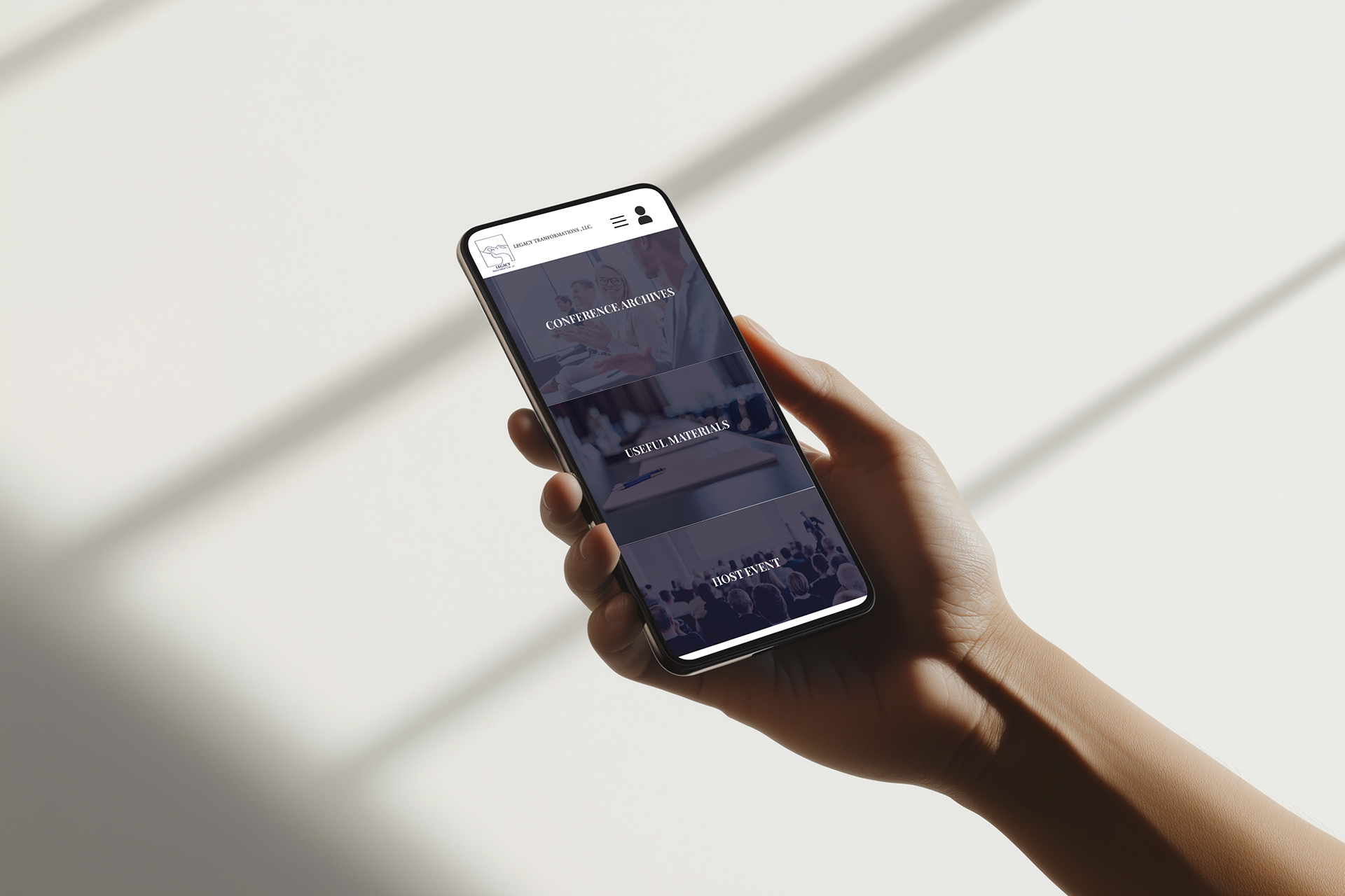
I moved into vector refinement by adjusting line weight, curvature,
and negative space, then applied the finalized mark across multiple
touchpoints, including the business card, letterhead, mobile app in-
terface, conference lanyard, and flyer. Establishing these applications
helped solidify typography, spacing, and color hierarchy. I selected a
deep navy as the primary brand color because it conveys trust, profes-
sionalism, and confidence.
Now that the brand system is fully developed, I feel confident in the co-
hesiveness of the identity across all materials. While the process involved
moments of rethinking and refinement, each stage helped clarify the
direction. Choosing the river and mountain concept allowed me to create
a consistent, meaningful, and intentional brand that reflects leadership,
growth, and long-term vision.